Exploring the User Interface
This page is a guided visual orientation. Use it before your first real task if the interface still feels unfamiliar.
The tour is split into:
Topology View Tour
For a deeper explanation of this area, see Topology window.
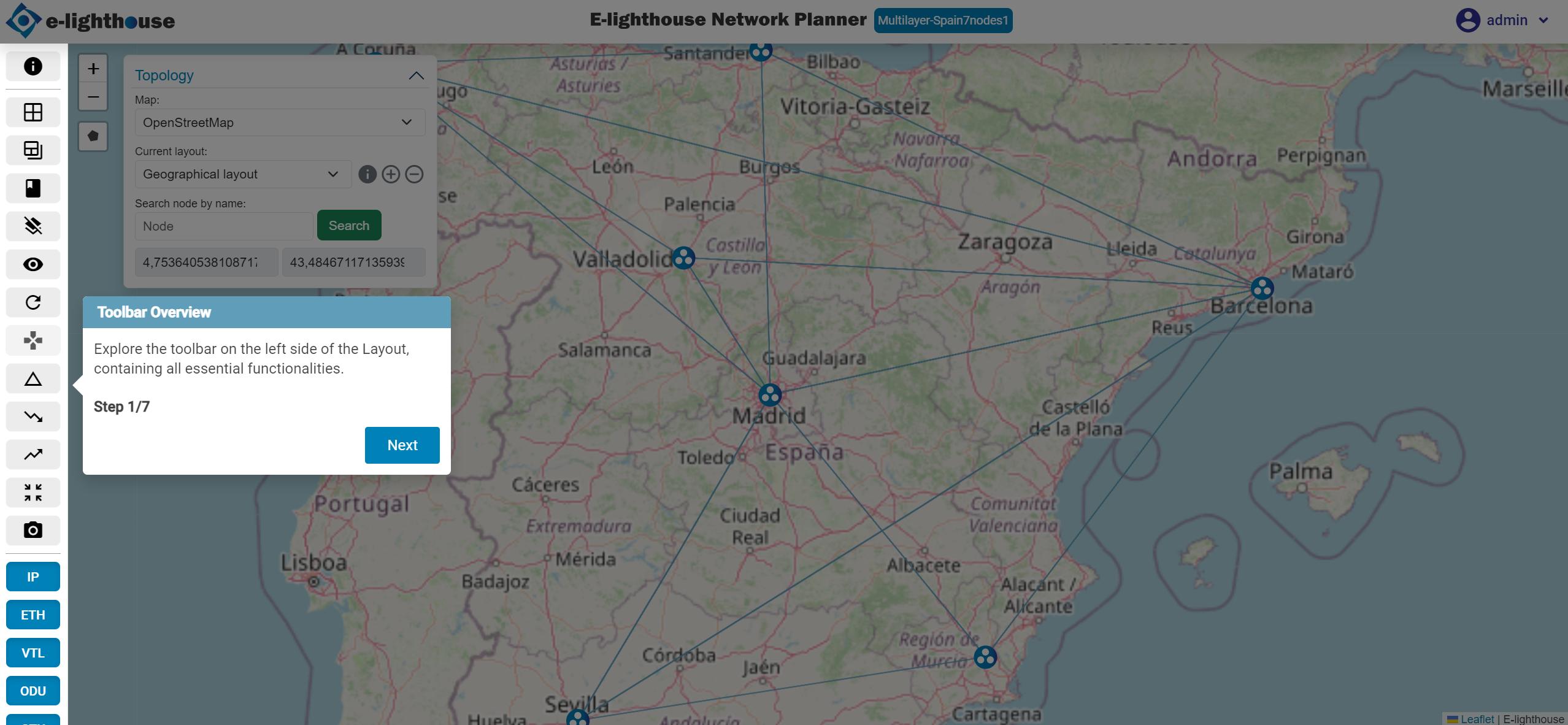
Step 1 of 7: Toolbar Overview
The left toolbar gives quick access to the actions you will use most often: file system, dashboards, controller tools, view options, and visual toggles.
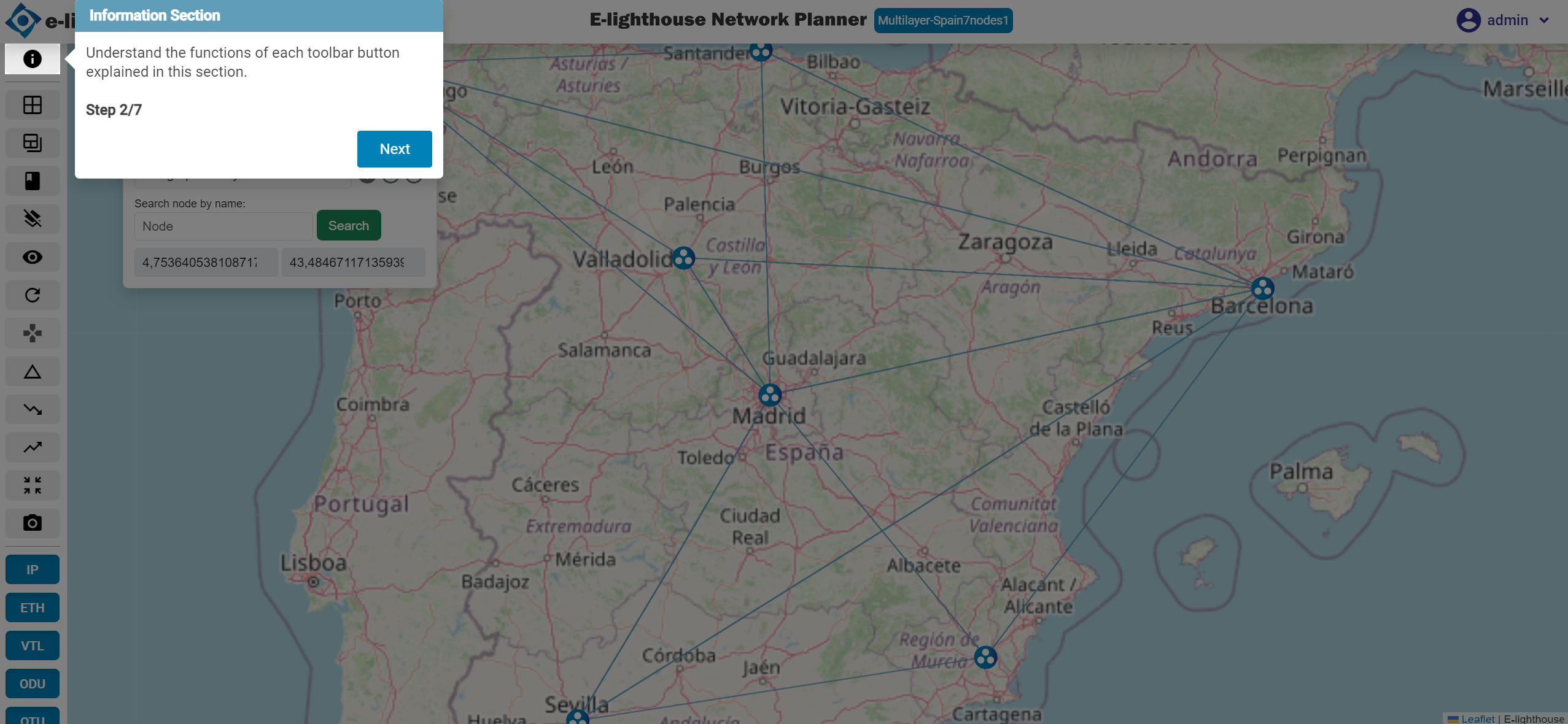
Step 2 of 7: Information Section
Hover over each button to understand what it does before clicking it.
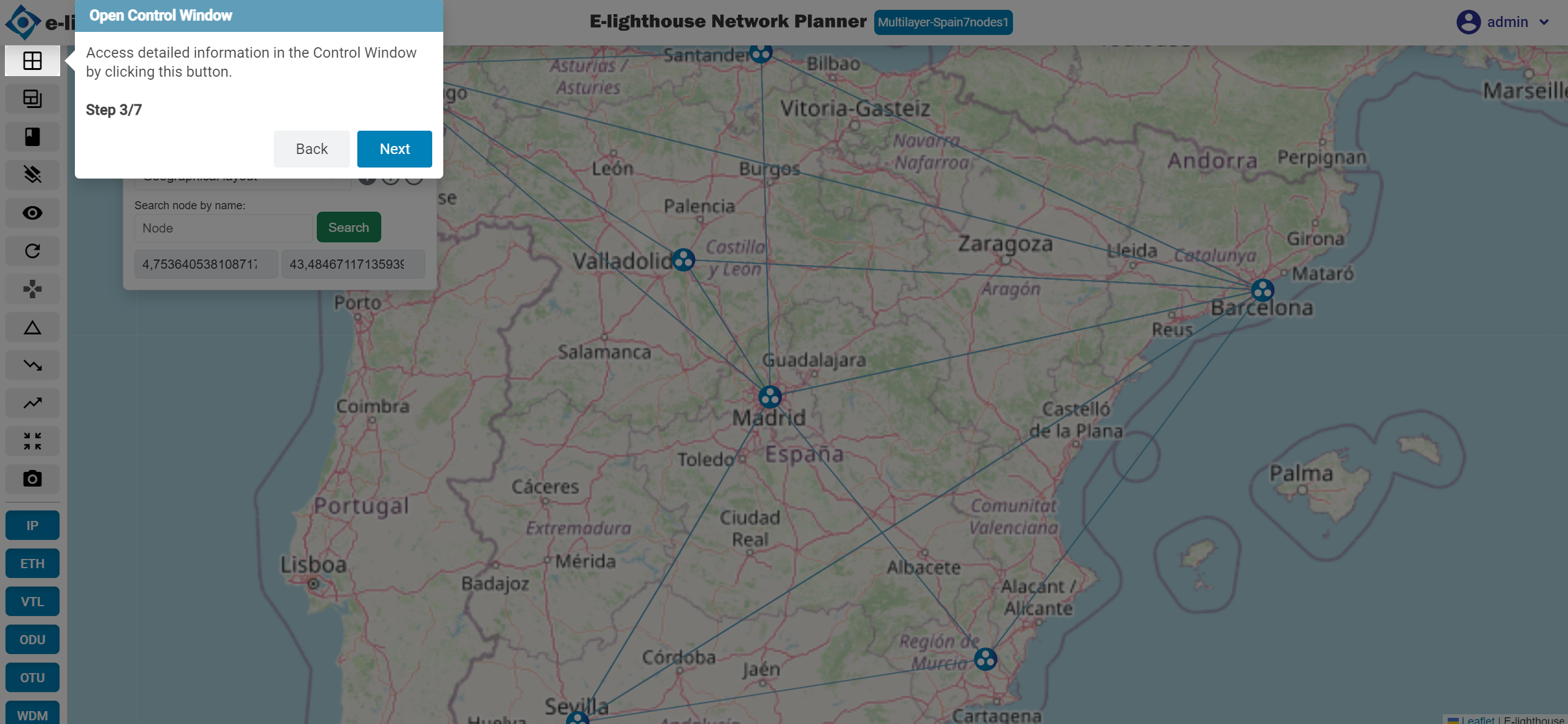
Step 3 of 7: Open Control Window
Use this button when you need to move from the visual workspace to the table-based workspace.
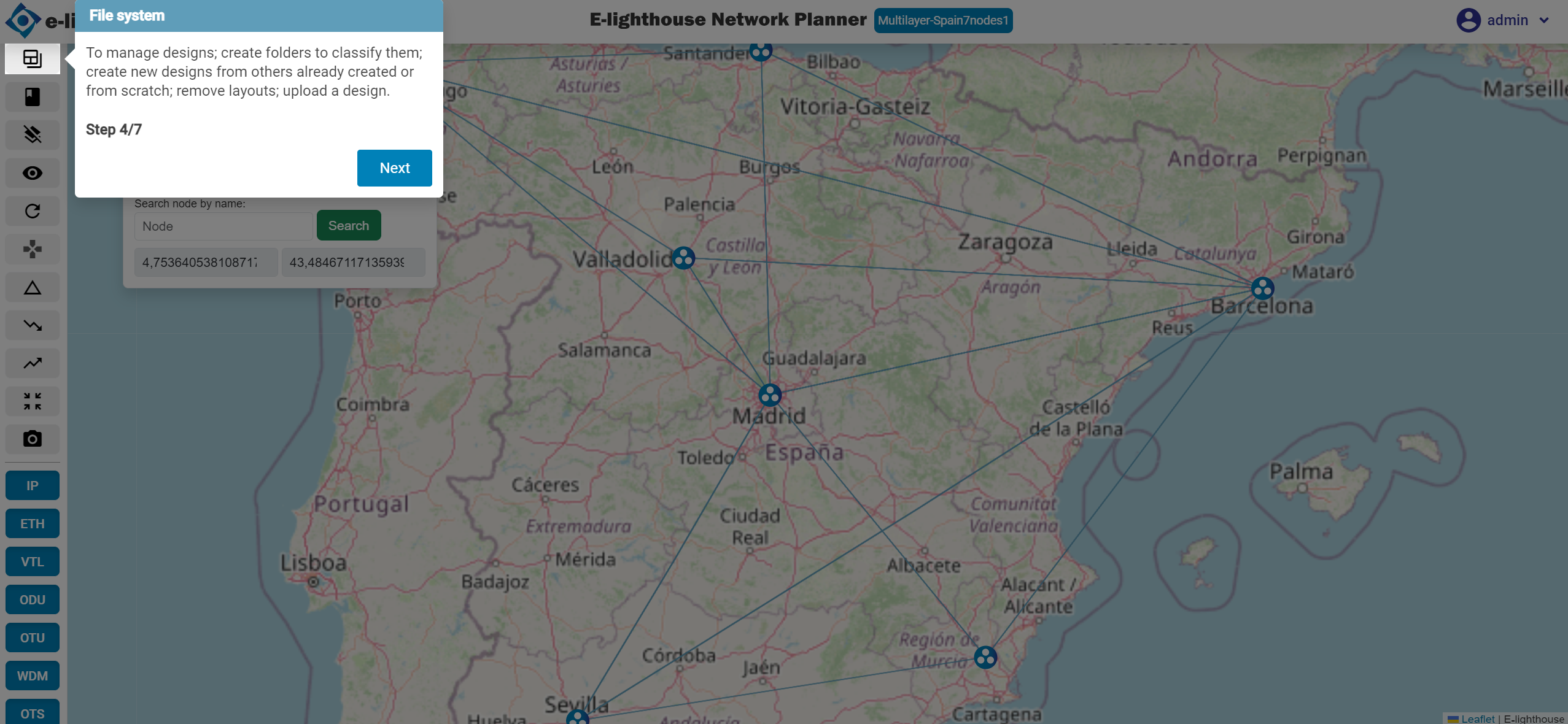
Step 4 of 7: File System
This is where you create, load, duplicate, export, and organize designs.
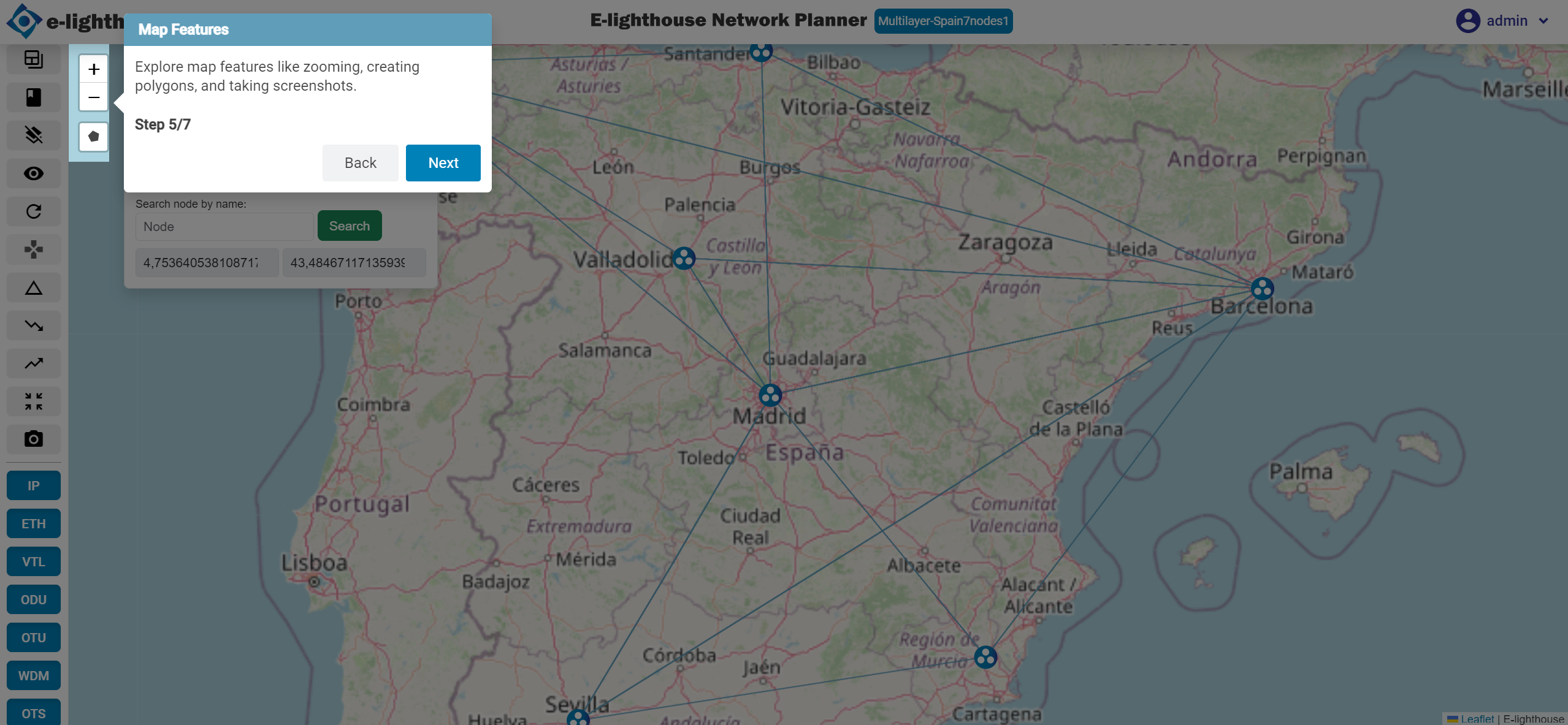
Step 5 of 7: Map Features
Use these tools to navigate the canvas, inspect regions, and capture the current view.
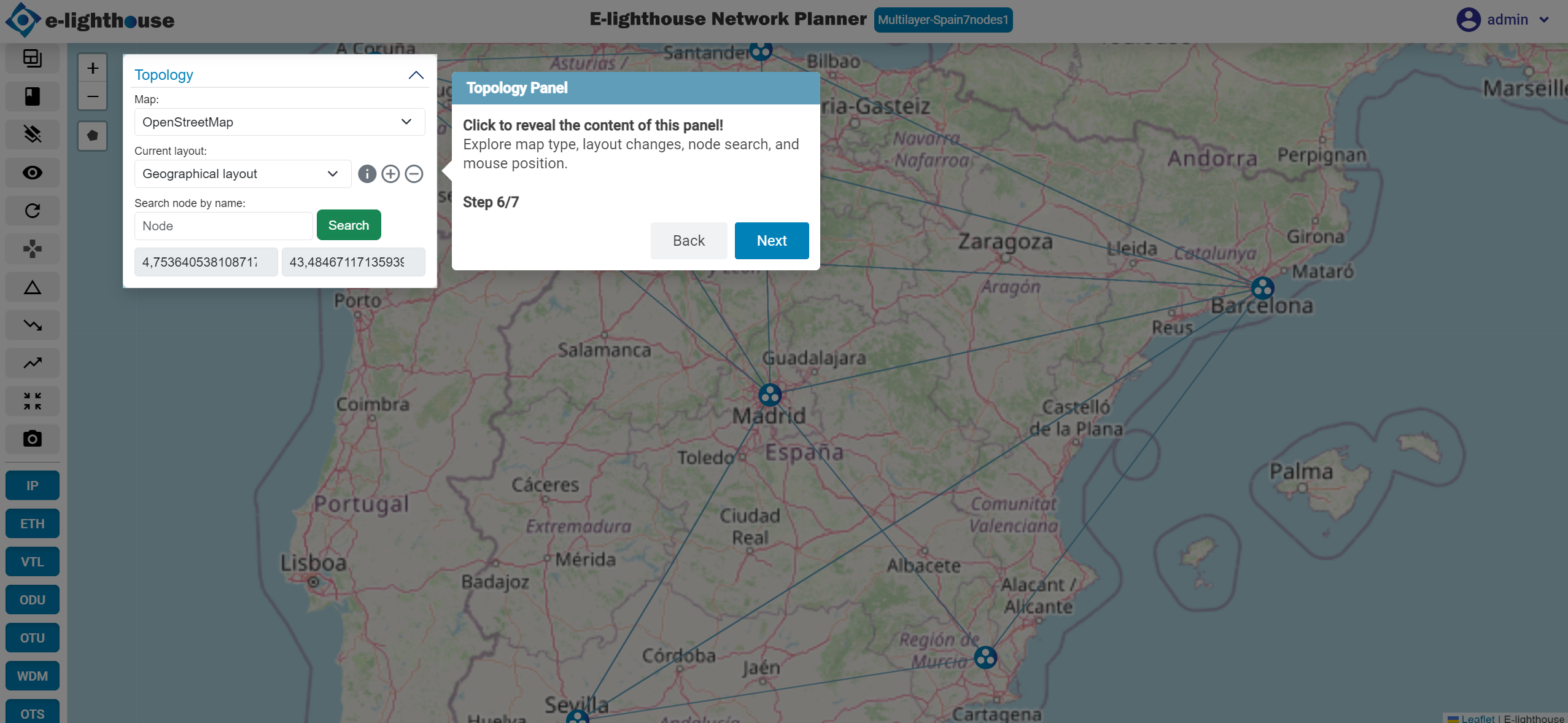
Step 6 of 7: Topology Panel
Use this panel to switch layouts, search nodes, and change map display options.
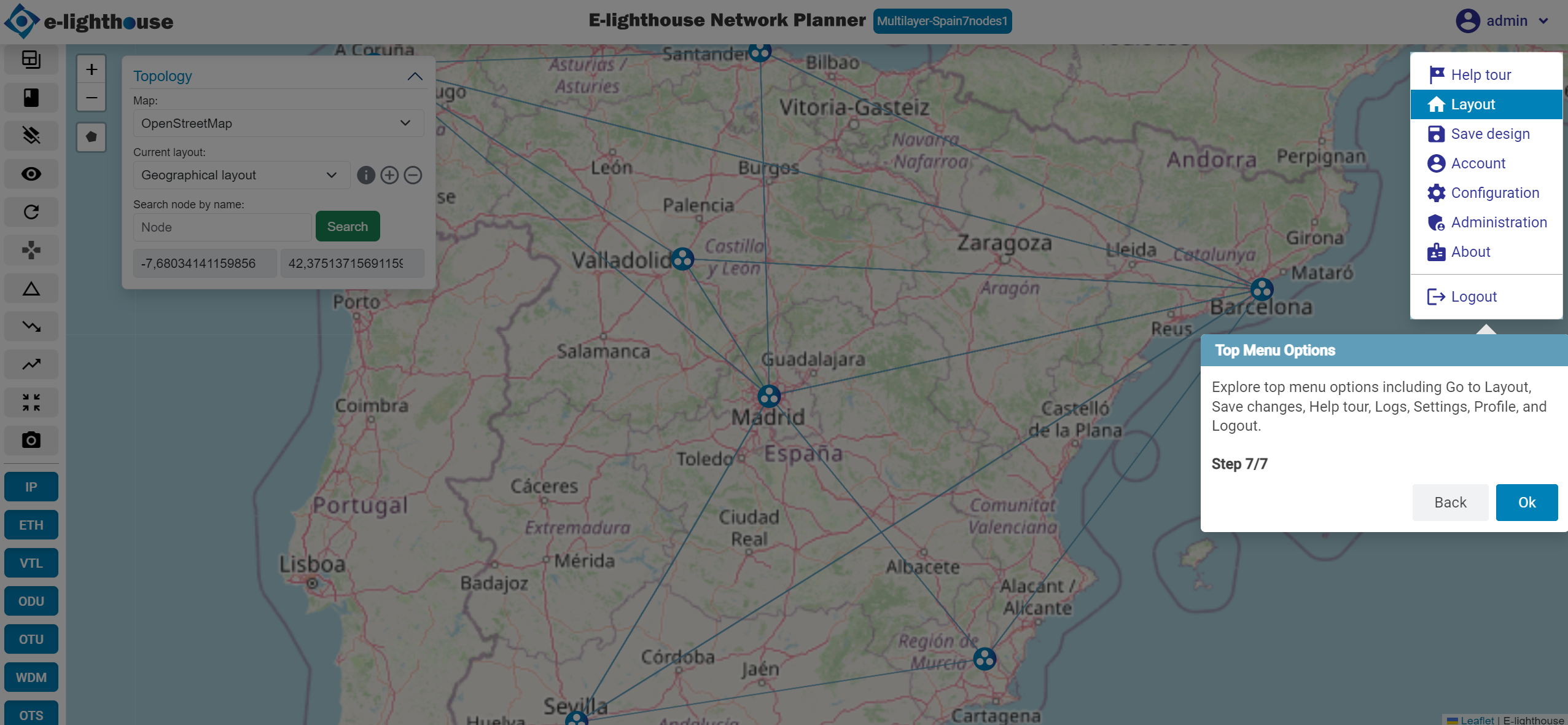
Step 7 of 7: Top Menu Options
The top menu contains global actions such as saving the current design, opening help, changing settings, and accessing your profile.
Control Window Tour
For a deeper explanation of this area, see Control window.
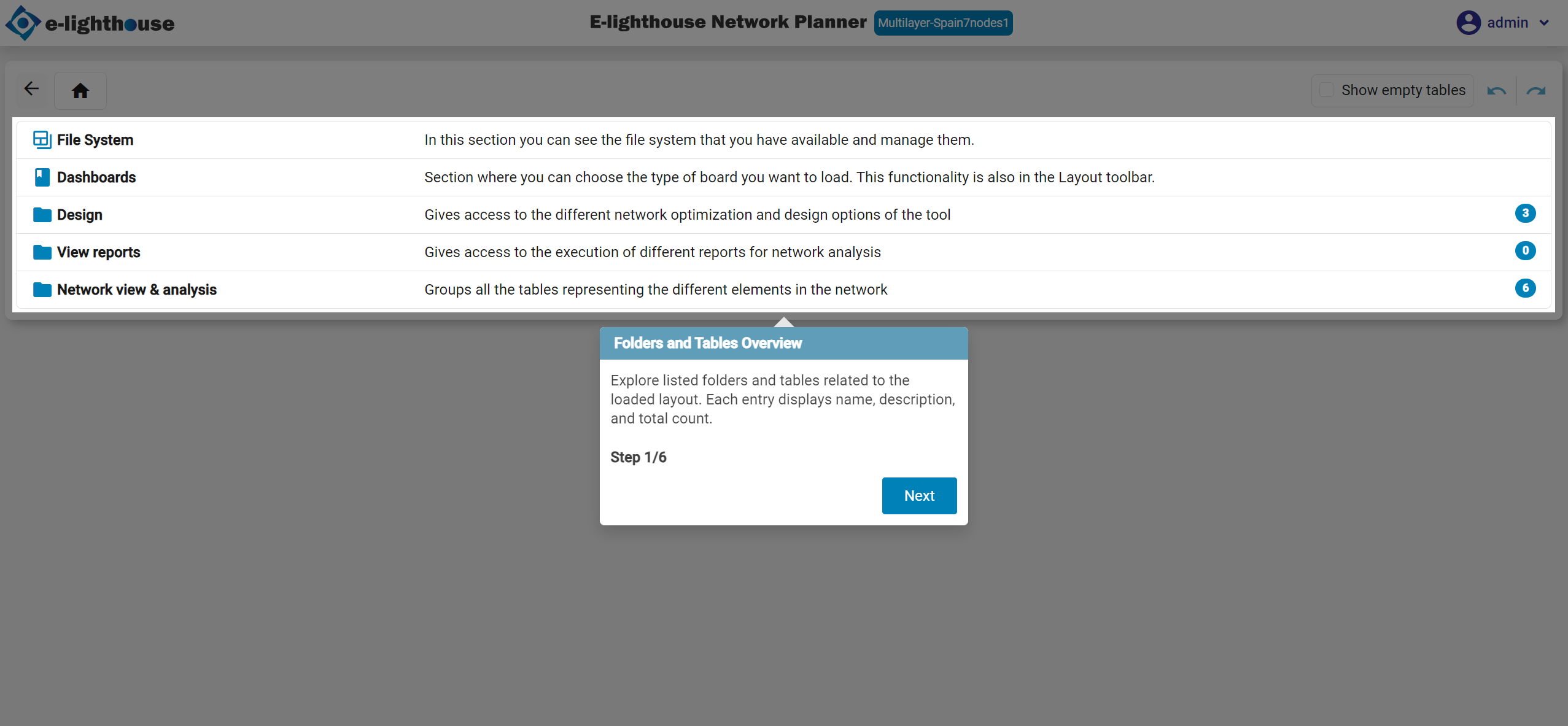
Step 1 of 10: Folders and Tables Overview
The Control Window organizes information into folders and tables related to the currently loaded design.
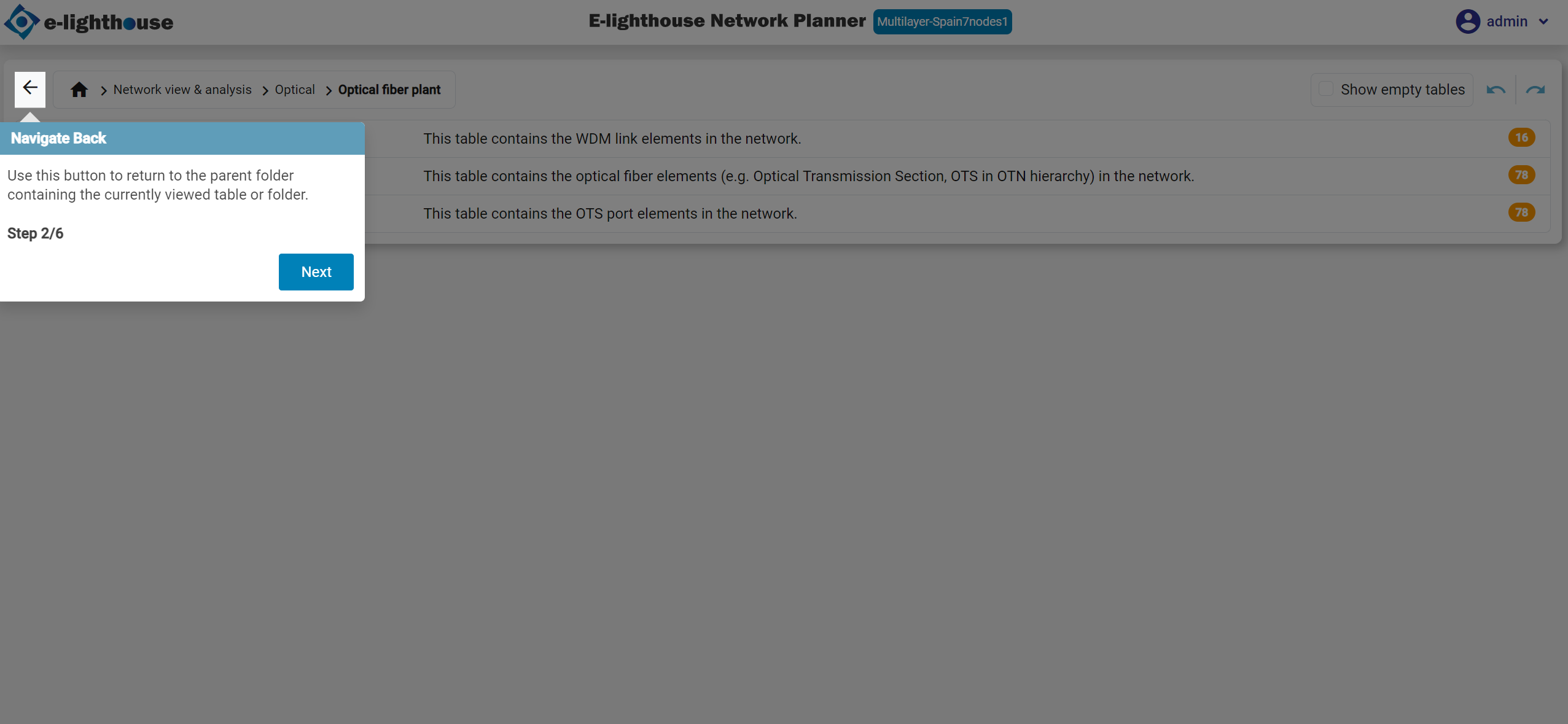
Step 2 of 10: Navigate Back
Use the back arrow to return to the previous folder level.
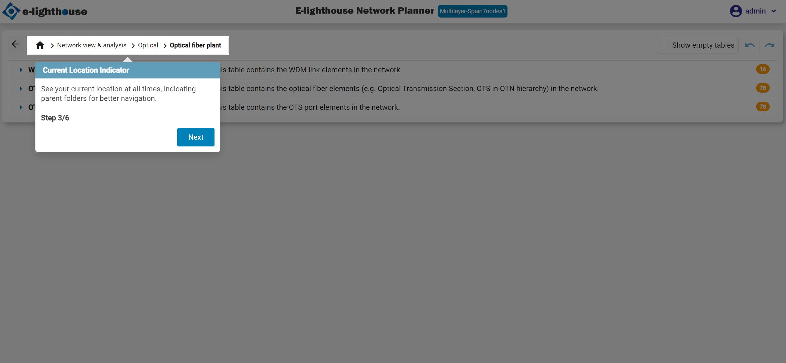
Step 3 of 10: Current Location Identifier
Use the current location indicator to keep context while you navigate across tables.
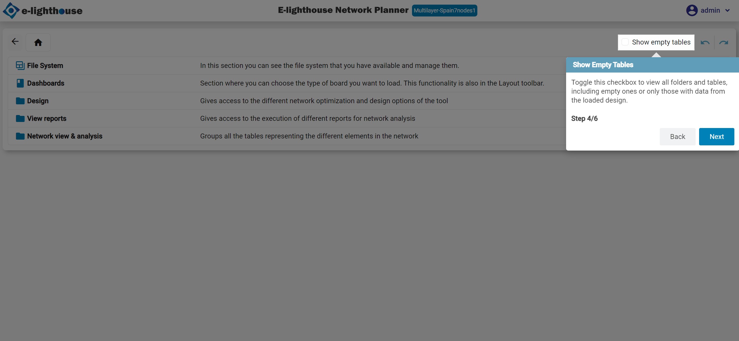
Step 4 of 10: Show Empty Tables
Enable this when you want to see the full structure, even if some tables are empty for the current design.
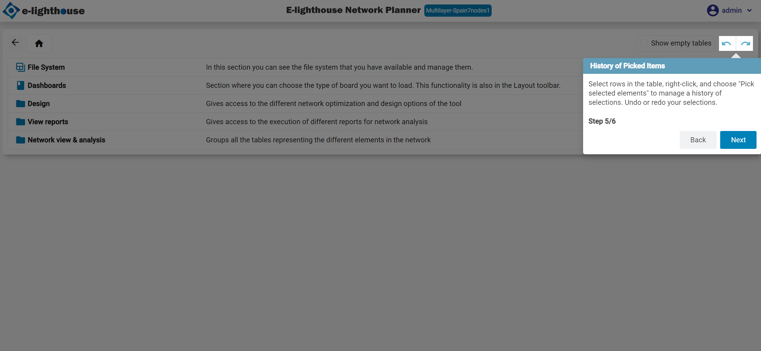
Step 5 of 10: History of Picked Items
Picked elements let you track selections across views and revisit them later.
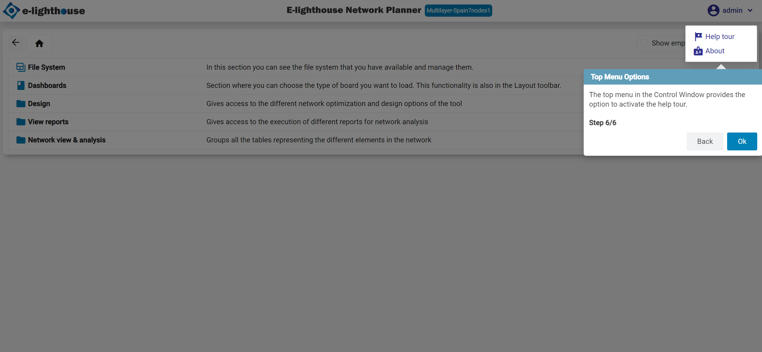
Step 6 of 10: Top Menu Options
The top menu also remains useful here for help and global actions.
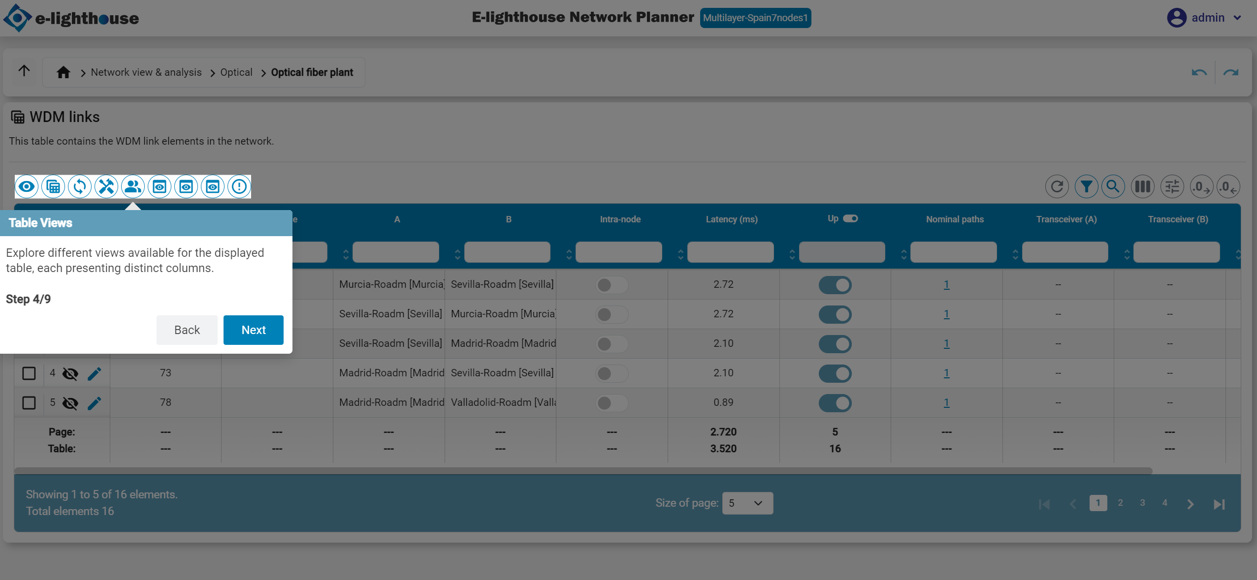
Step 7 of 10: Table Views
Table views help you focus on the subset of columns that matches the task you are doing.
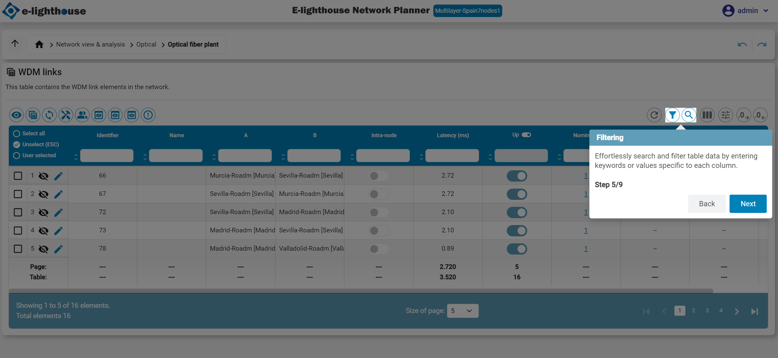
Step 8 of 10: Filtering
Filtering is one of the main reasons to use the Control Window instead of the visual workspace.
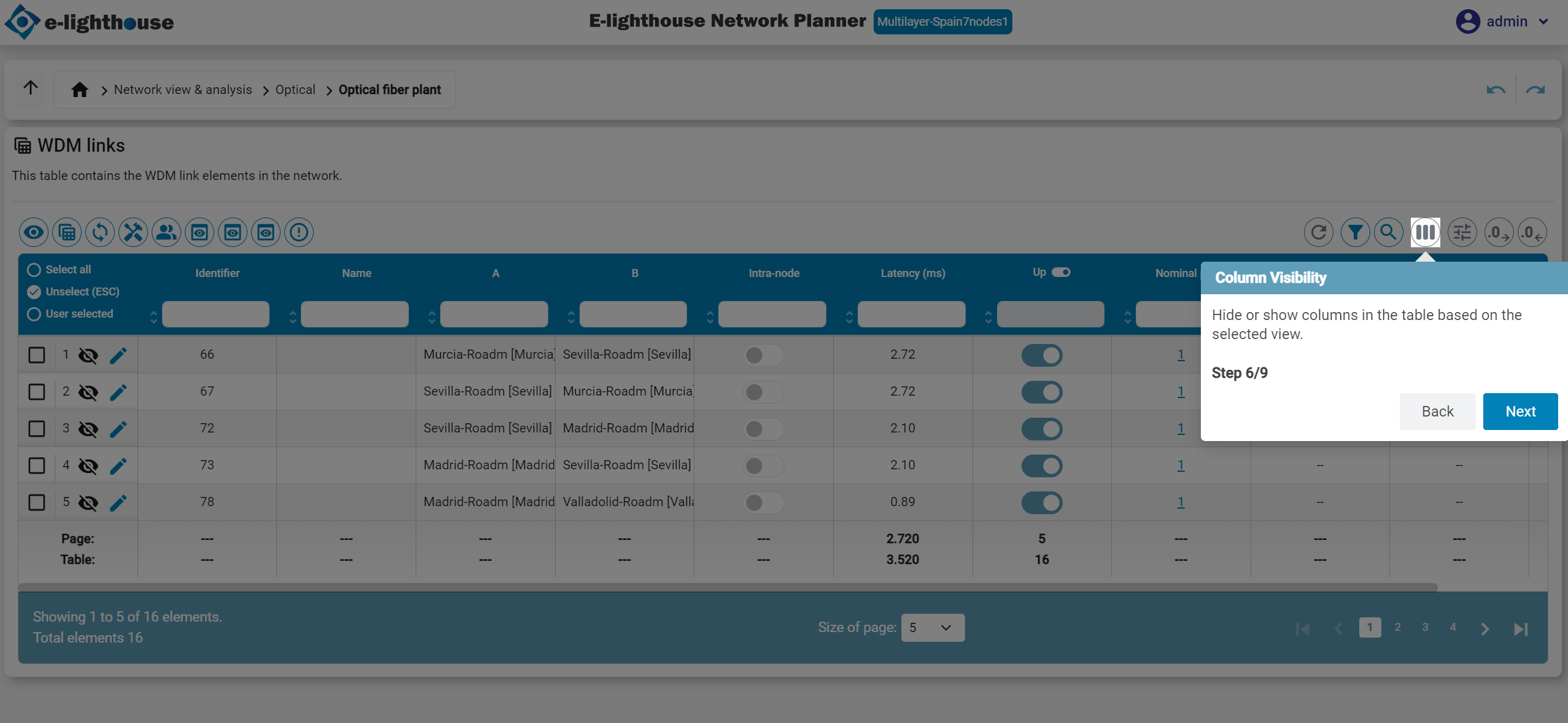
Step 9 of 10: Column Visibility
Hide columns that add noise and keep only the information you need.
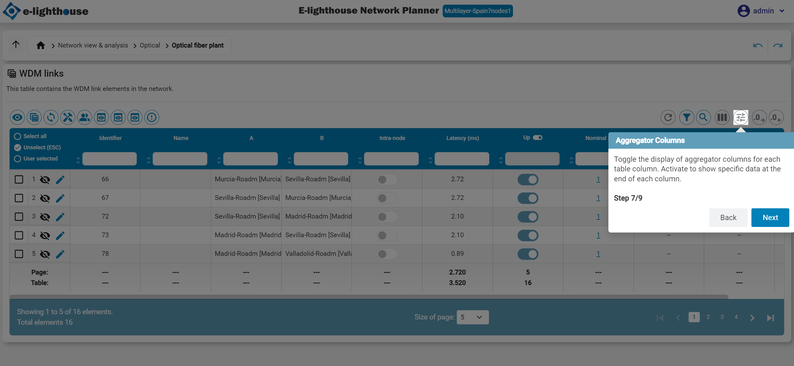
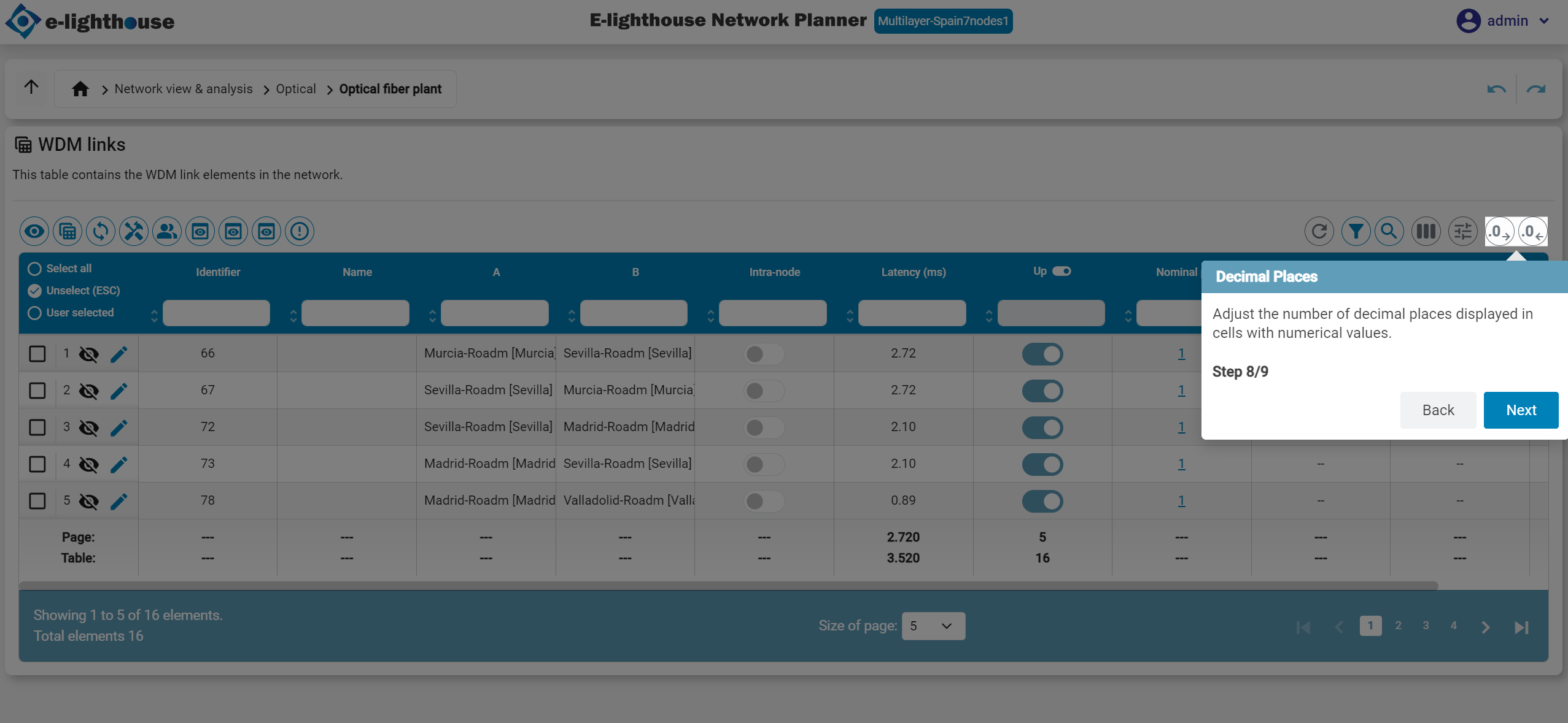
Step 10 of 10: Aggregator Columns & Decimal Places
Use aggregators and decimal controls when you need summary numbers or cleaner table formatting.
Next Step
Now that you know where the main controls are, continue with Build your first network.